Hot Octopuss is a UK-based company pioneering bespoke sex toys with an edgy and inclusive approach, aiming to address exclusion and stigma while championing individual pleasure needs.

We were tasked with redesigning and developing Hot Octopuss’s e-commerce site. Their old site was not converting well and had significant issues with mobile responsiveness and speed. I focused on a mobile first design system and used design patterns from leading e-commerce websites to improve conversion.
This was the first big project I managed from start to finish. I was also the lead designer and assisted the development team towards the end of the project.
The workshop
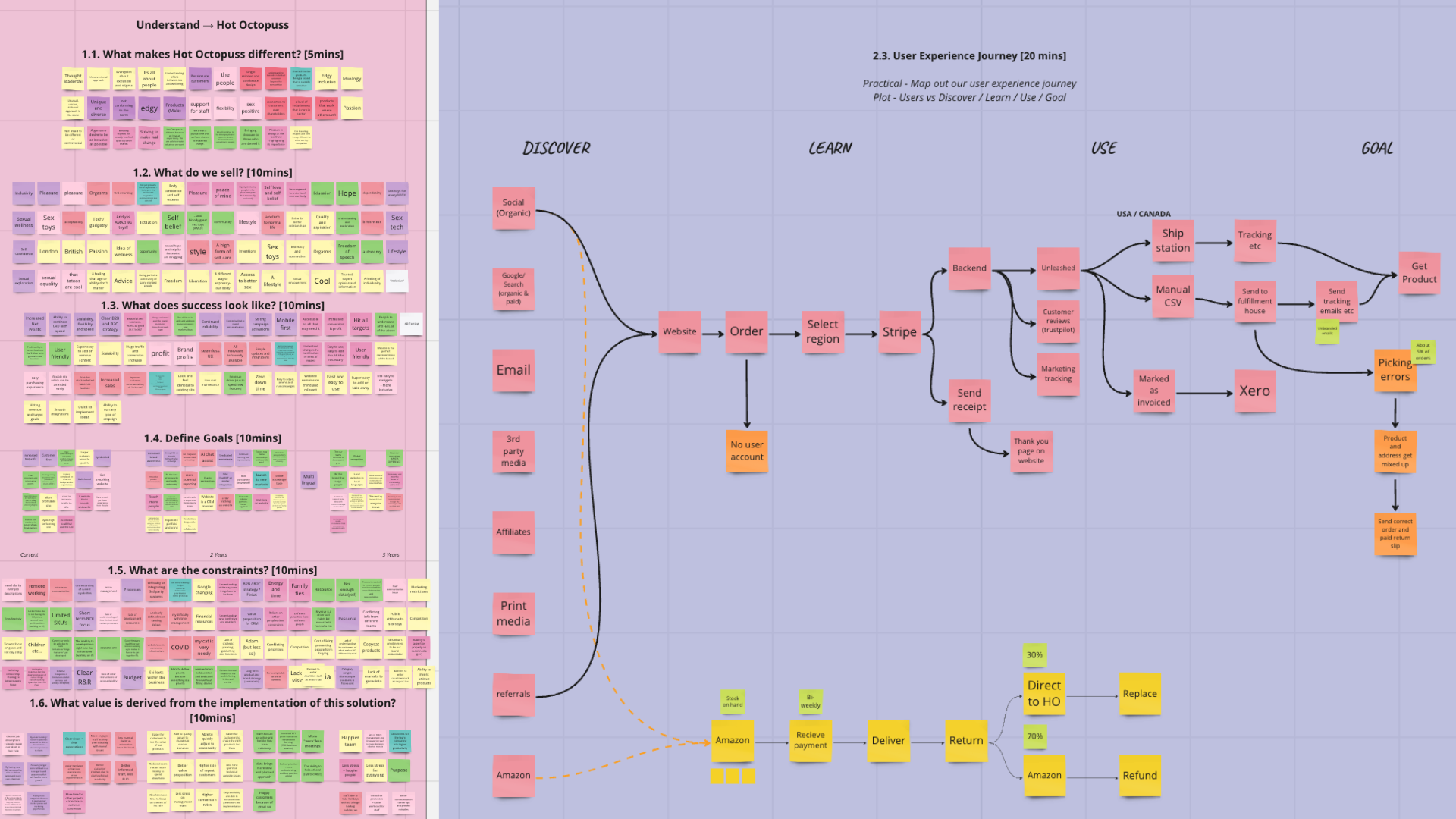
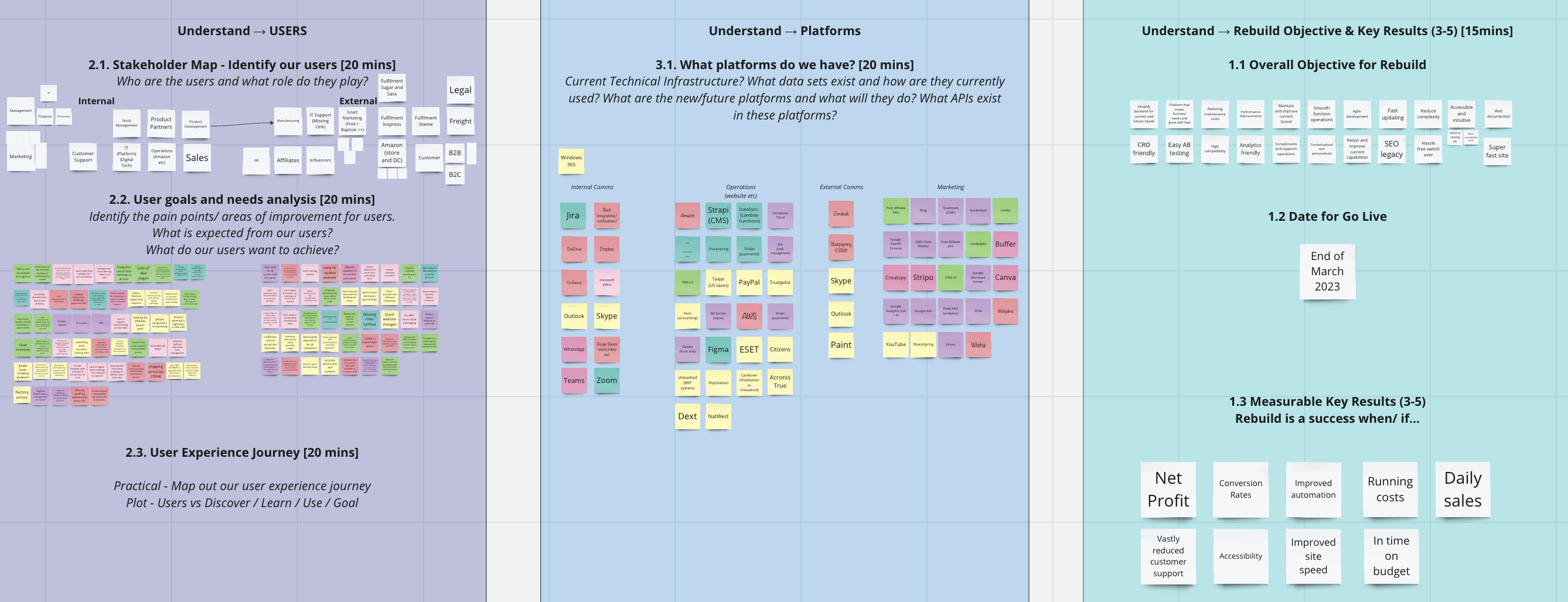
Tyrann and I facilitated a workshop with the Hot Octopuss team. This initial workshop focussed on getting to know the client and their business goals for the site rebuild. Our key findings were:
- Hot Octopuss is a brand that stands out with its unique offerings and socially sensitive approach.
- Their products and marketing focus on pleasure, education, body confidence, and self-esteem.
- The goal is to create an inclusive and supportive community, not just sell products.
- Success is measured by increased net profits, increased brand awareness, and seamless user experience
The Hot Octopuss team also told us about the customer pain points on their old site. The main concerns were the site did not have a great mobile experience and there were key areas where functionality was difficult to find or missing all together. The site also suffered from slow load times.
Refining the old site
After digesting all the information provided by the client I started going through the existing site in depth. The client was happy with the UI design for the most part but just wanted more consistency. I found a few areas that had UX issues, specifically the main mega menu navigation, the product highlights on the homepage, the product list pages and the product detail pages. I also designed every page for both mobile and desktop to ensure responsiveness was prioritised and clearly understood by the development team when we went to build the site. Many of the changes I implemented were fairly simple but our aim was to make an ecommerce site that felt familiar and “got out of the way” of the customer.
The main menu was very difficult to navigate. The layout was cluttered towards the top and then sparse below that making it look unfinished. There was also a static product image on the left which made the changing categories unclear. I improved the menu functionality by switching the horizontal orientation of the menu categories to vertical. This created a more natural movement to select the category. I chose to include different colours for each category to highlight when you had changed categories. I also made the target areas to click on specific products more clear by boxing them in. On the old site the mobile menu scrolled away as you moved down the page. This was easily fixed by just making the menu sticky on the new site.
The homepage experience on the old site, the side menu would open when you click on the right hand arrow. It is missing on mobile. Also notice the mobile menu has scrolled away
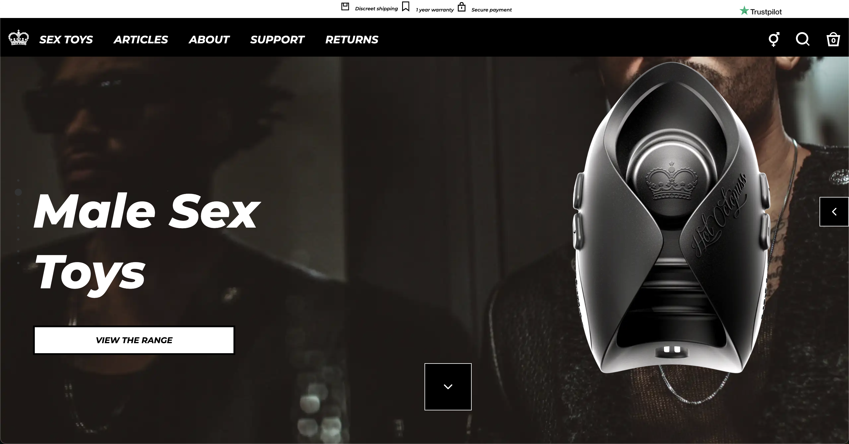
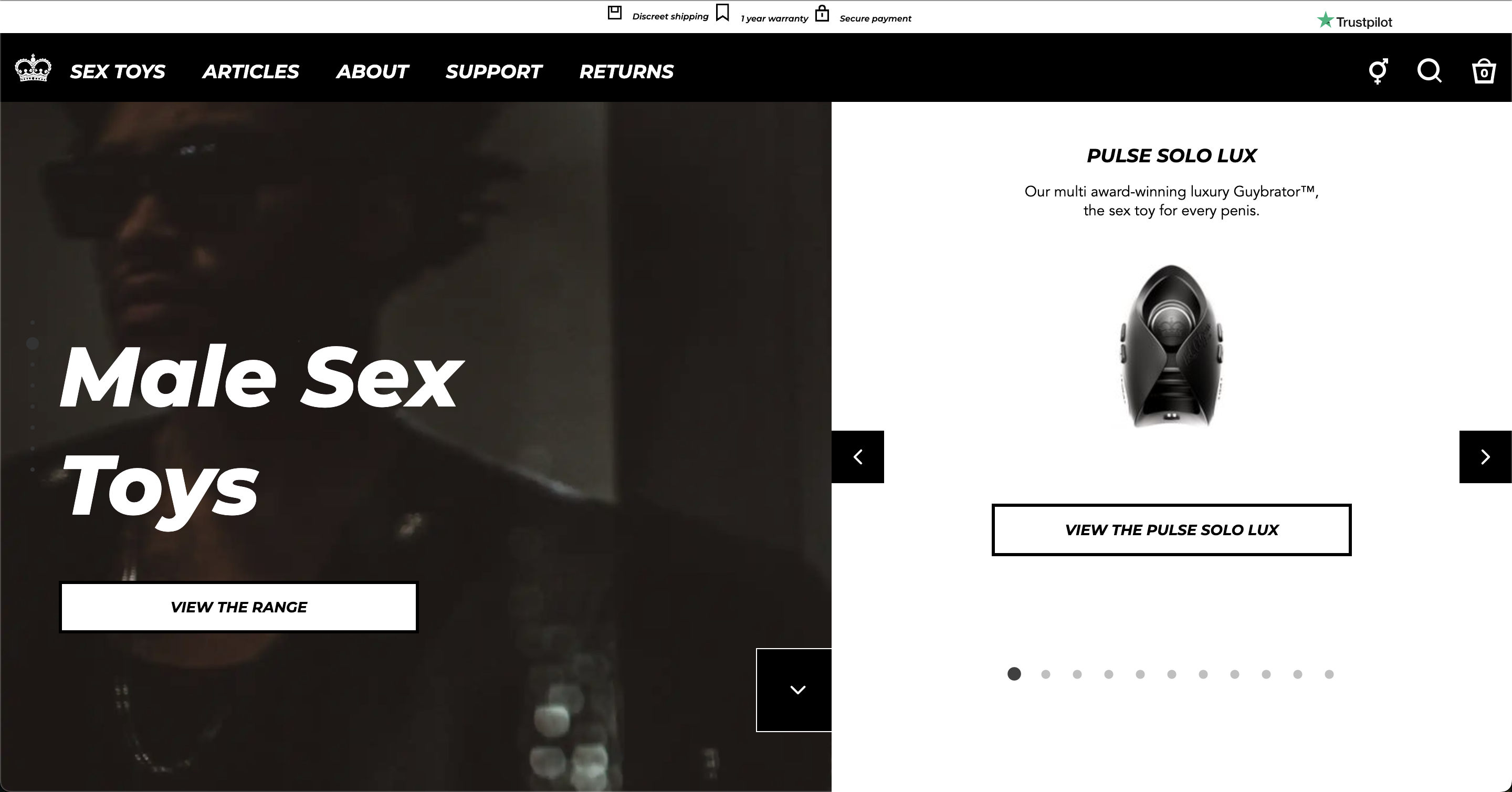
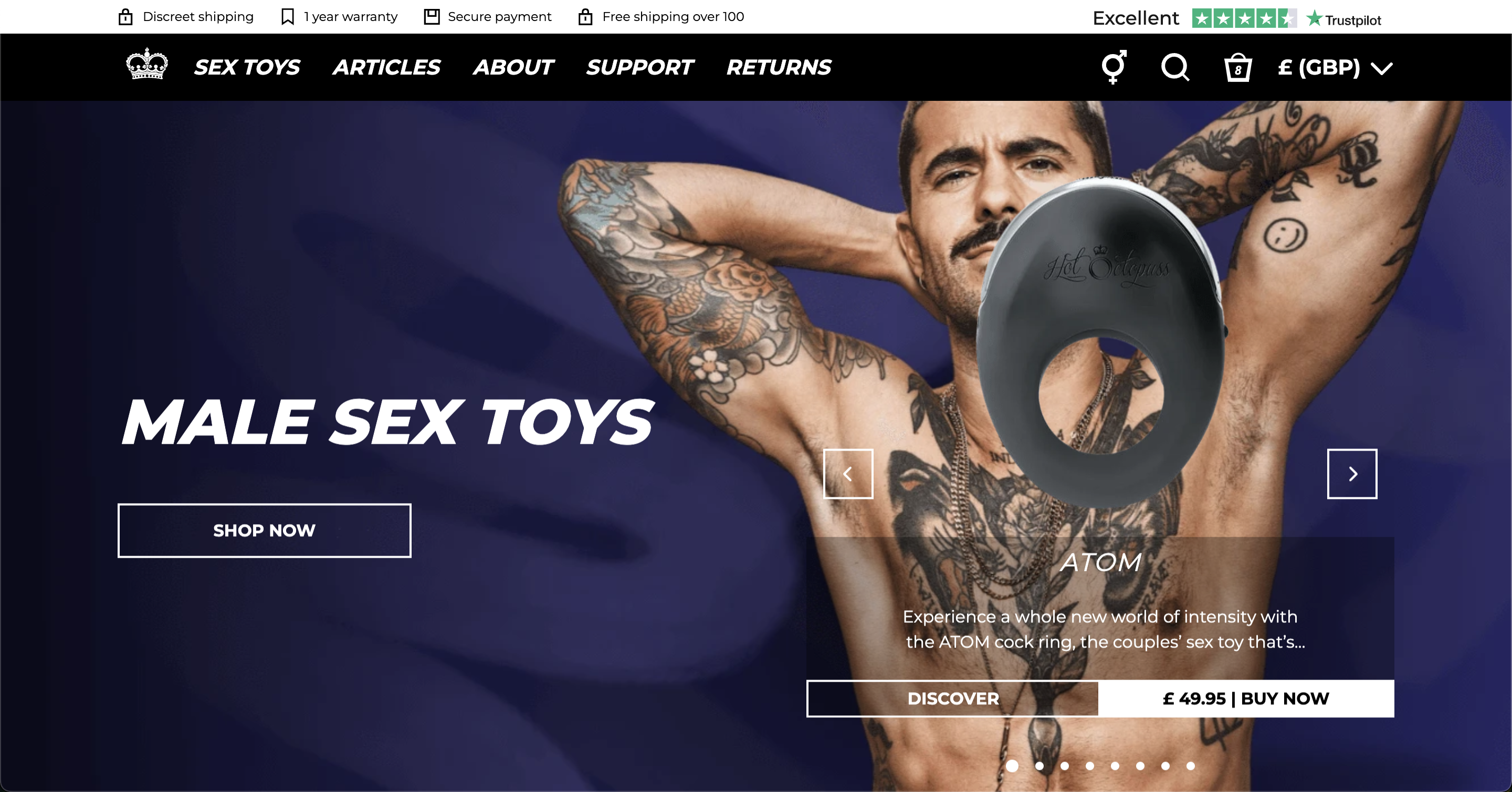
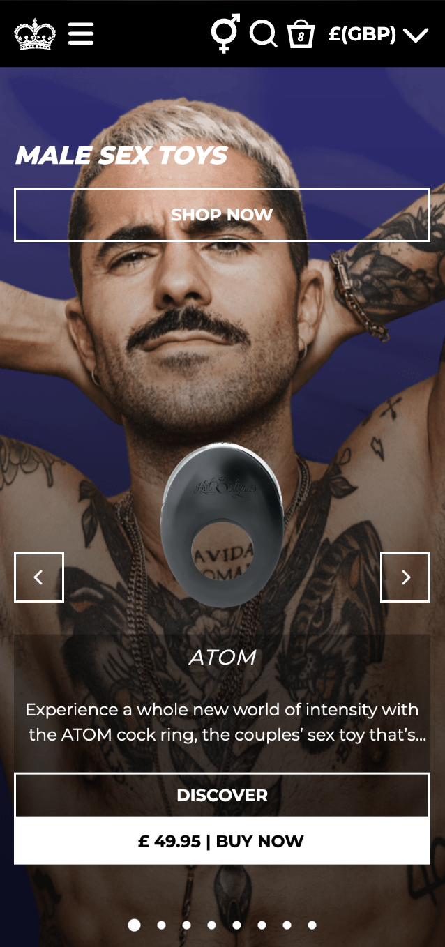
The next issue I resolved was with the product highlights on the homepage. On the old site each hero block on the homepage had an arrow on the right hand side with no label. When clicked a carousel of the products in that category would pop out so customers could find out more, these sections included only an image and a brief description of the product, there was no pricing or promotion information here. This was very unclear and easily missed. I moved the carousel into the hero section which shows the customer products as they land on the site. Customers can add it directly to their cart from there or choose to find out more about the product. Sales can also be highlighted here. This uses prime homepage real estate to promote the purchase of products.
The new homepage experience. Customers can add products to their cart directly or find out more about them.
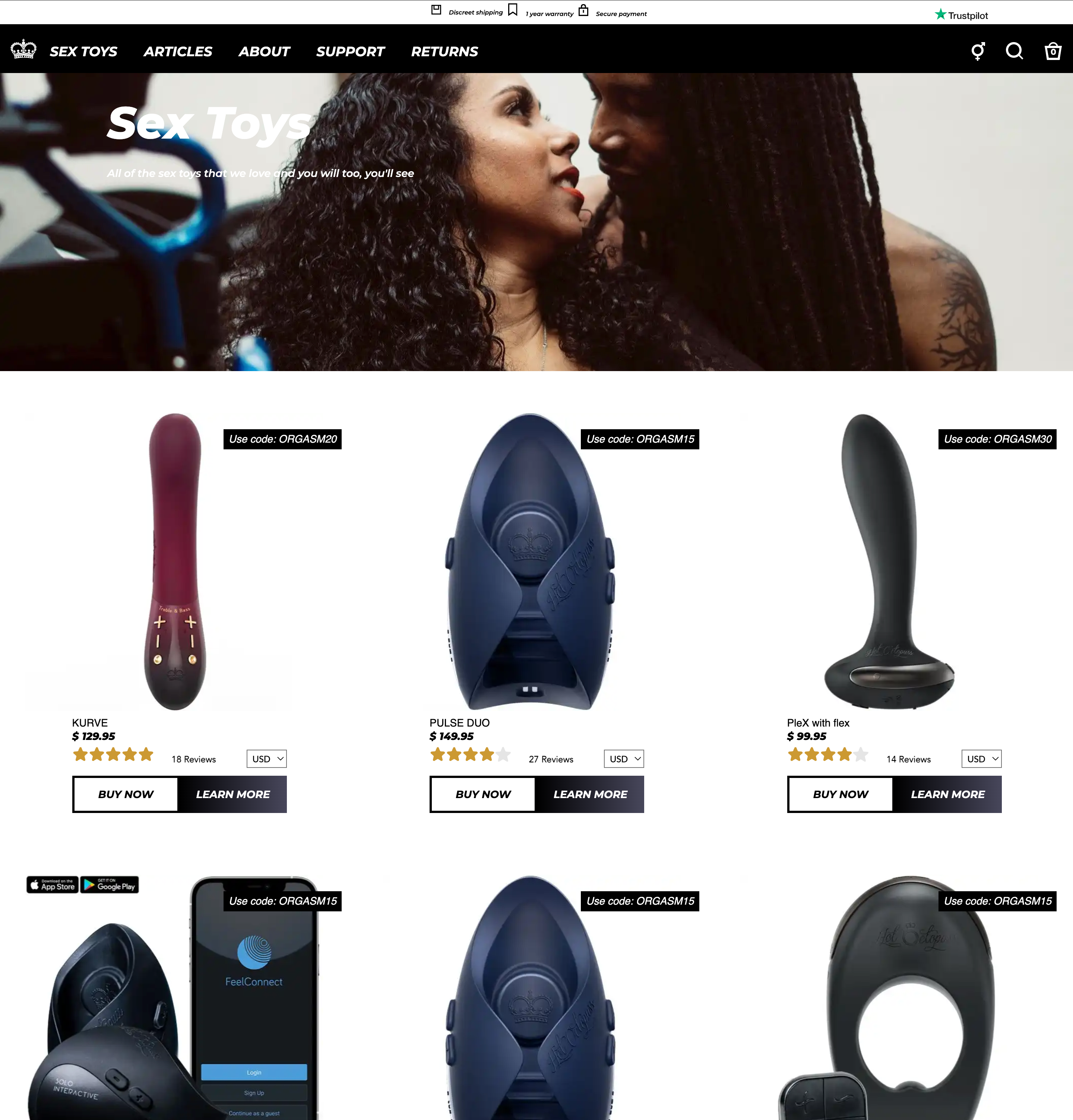
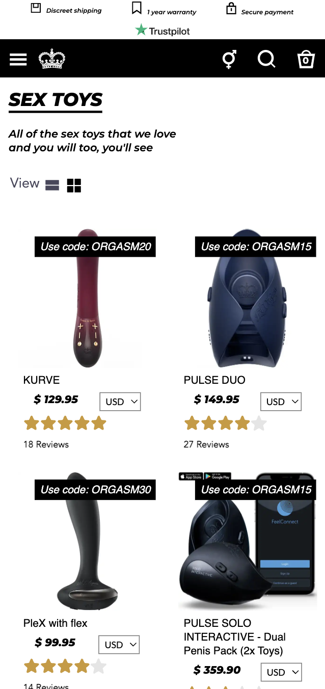
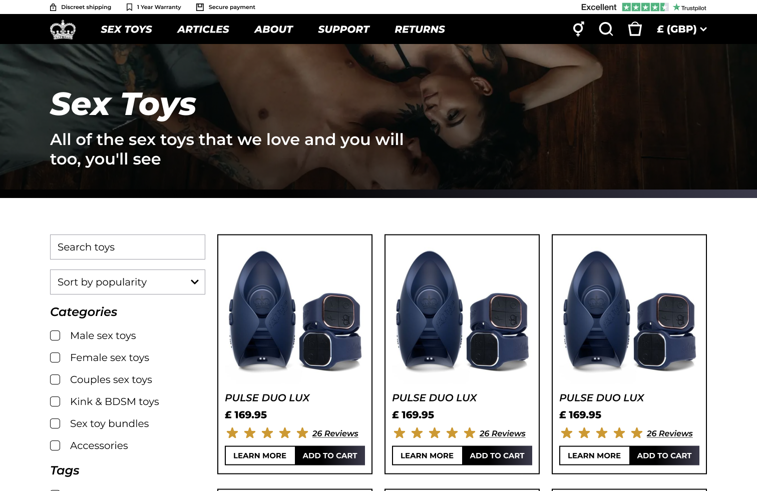
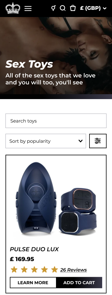
Next I worked on the product listing page. On the old site there was no way to search for products or filter them, even when on the “all sex toys page”. This forced customers to navigate through the main navigation multiple times to potentially find what they were looking for. I updated the page to include a search, category filters as well as tag filters. This allows customers to narrow down what they are looking for while still being able to compare products and prices.
The product list page design. I included basic search and filters on the products as well as made the text more legible regardless of the image the content team choose. On mobile the filters collapse and can be opened in a menu
Finally I addressed the issues the client highlighted and I found on the product detail page. The old product pages had image banners which forced the user to scroll unnecessarily to get down to the “add to cart” button. The client also found the colours used in the illustrations overwhelming and didn’t like the repetitive layouts used. The improvements I made were to restructure the content “above the fold”. I established a clear typography hierarchy to make the information easier to digest. I also toned down the colours of the illustrations and varied the layouts of the content to allow the content team more flexibility.
A modular strategy
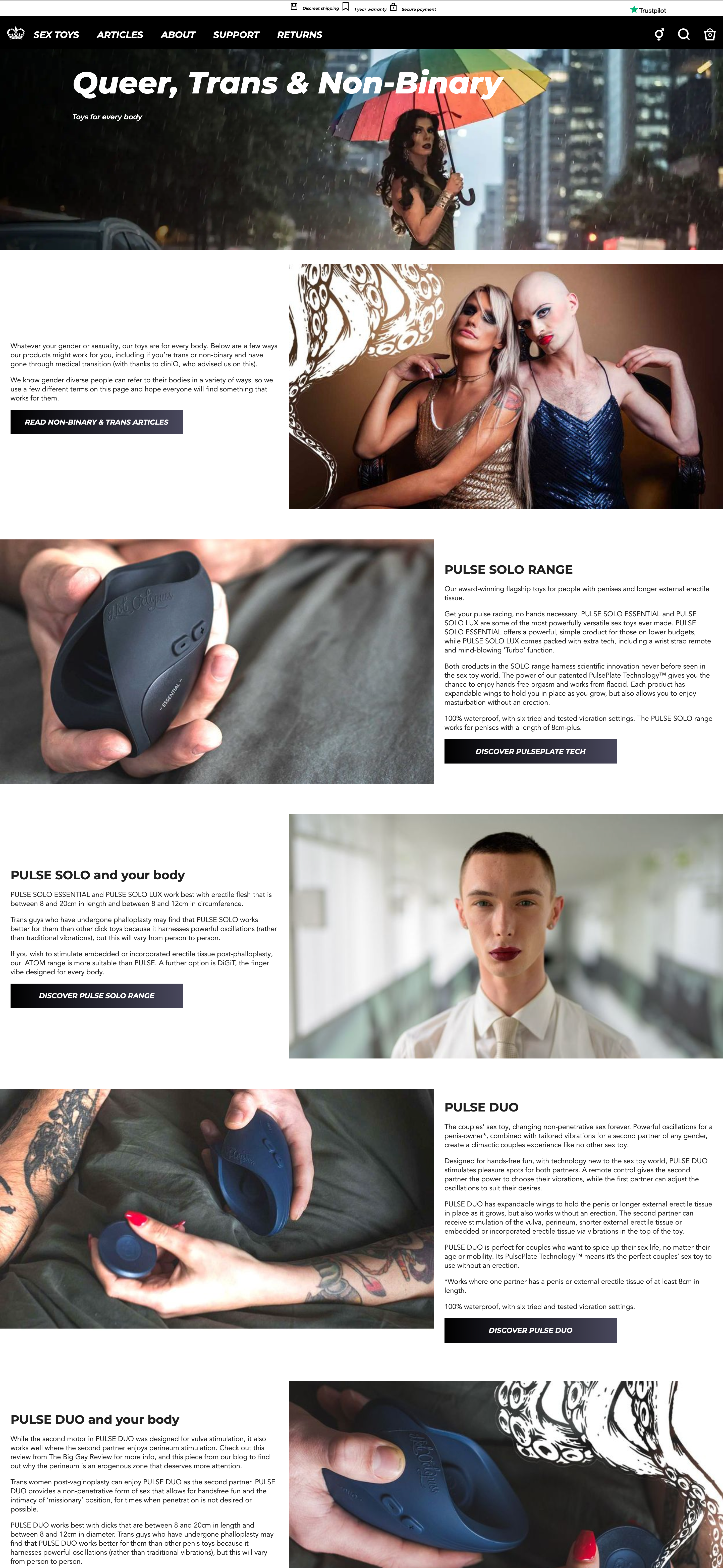
A key point the content team made was they needed to be able to update the site easily while keeping consistency across the content pages, product pages and articles. They struggled to build interesting content rich pages because they only had a few components to work with. I chose to develop a new set of components or blocks that could be used by the content team to build what they needed. These included
- A bold heading strip with colour options from the brand guidelines to break up the content
- A basic image and text block
- A pull quote block
- A product feature section
- An icon/image with text block
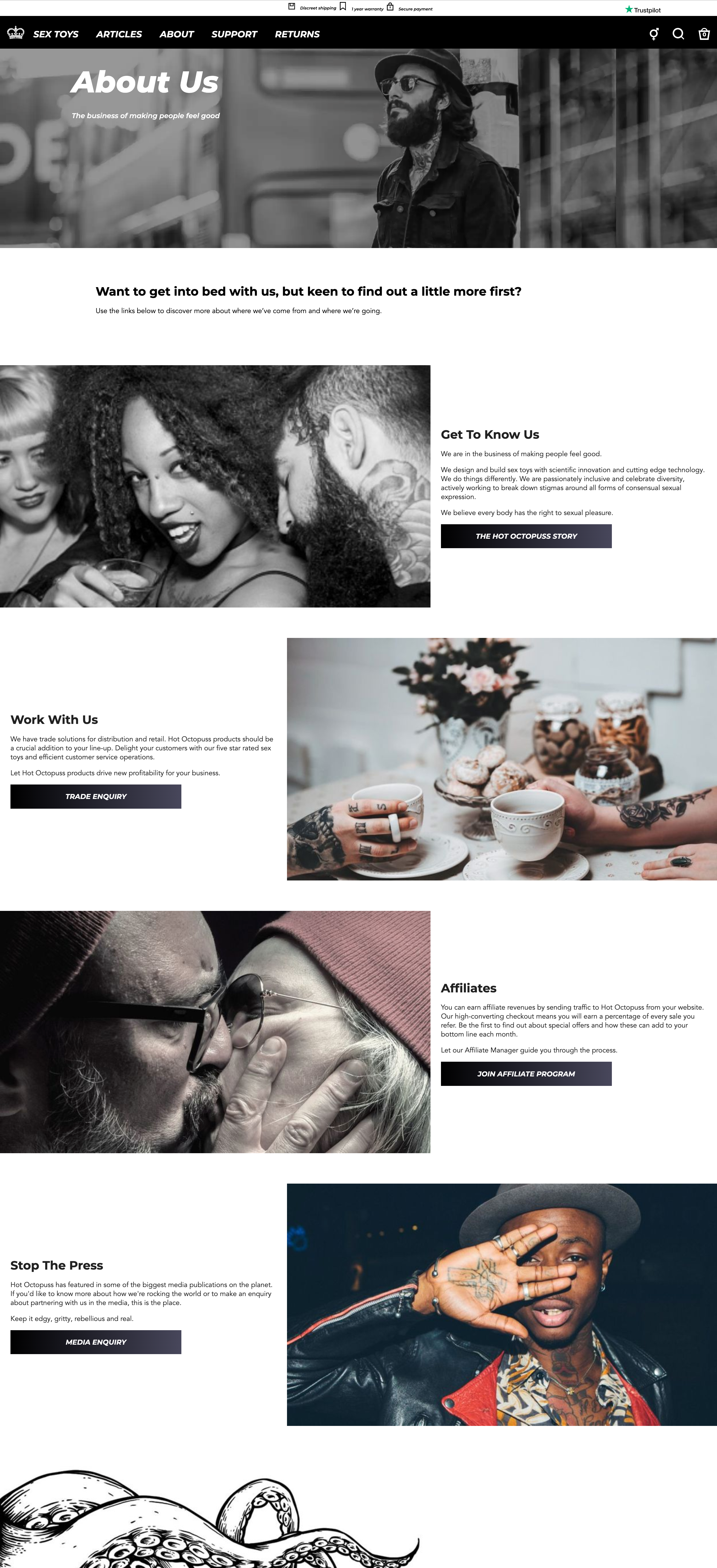
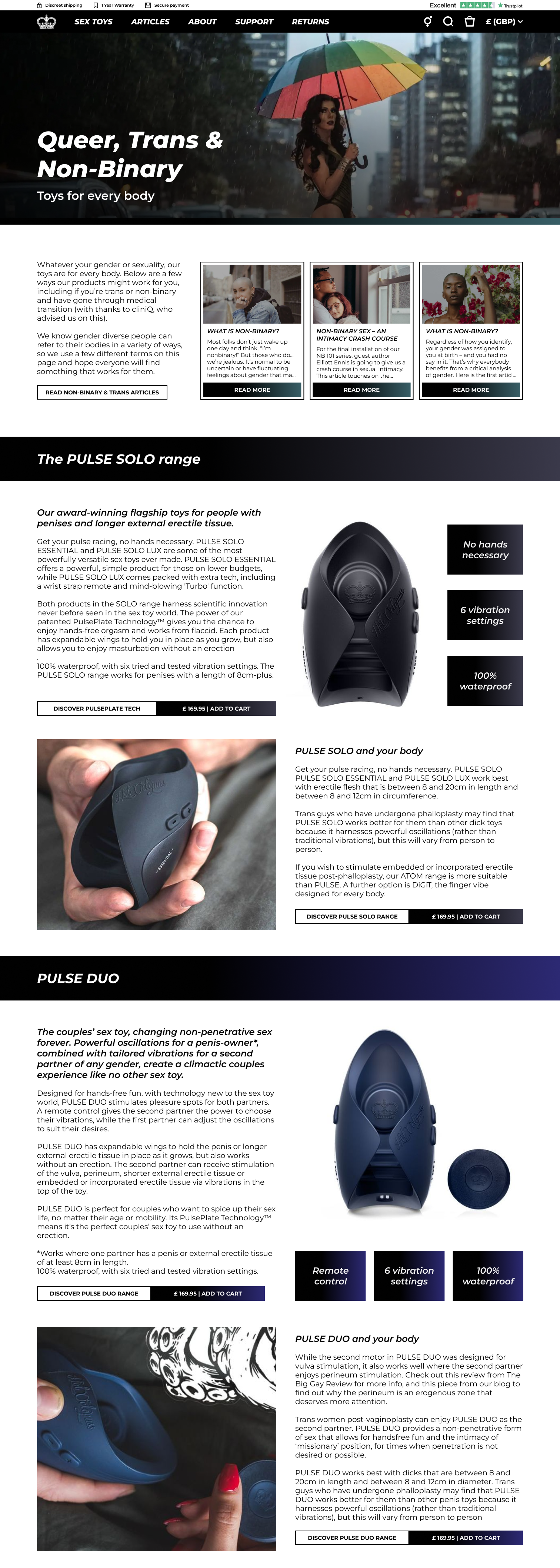
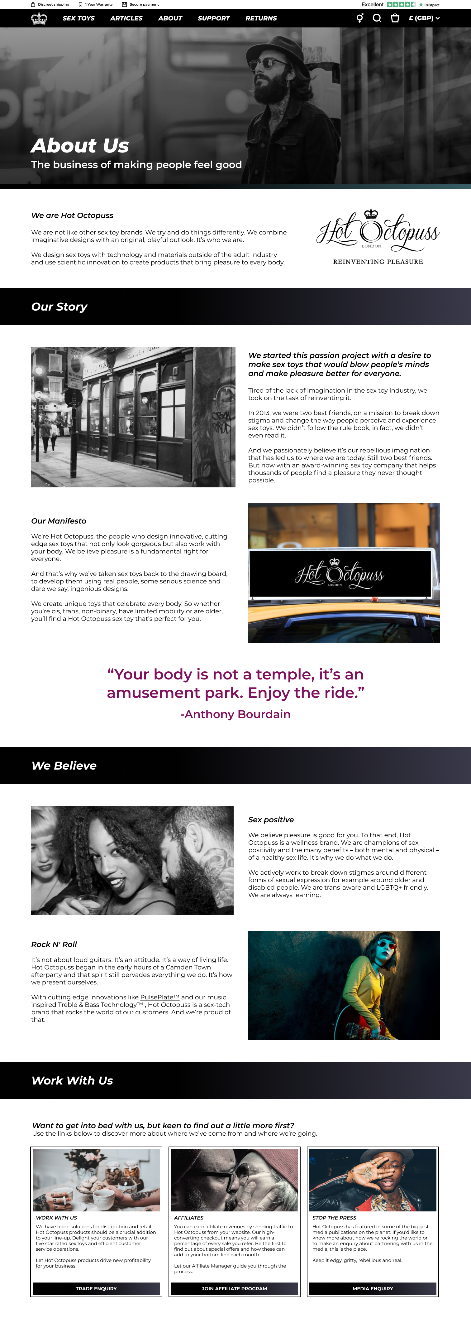
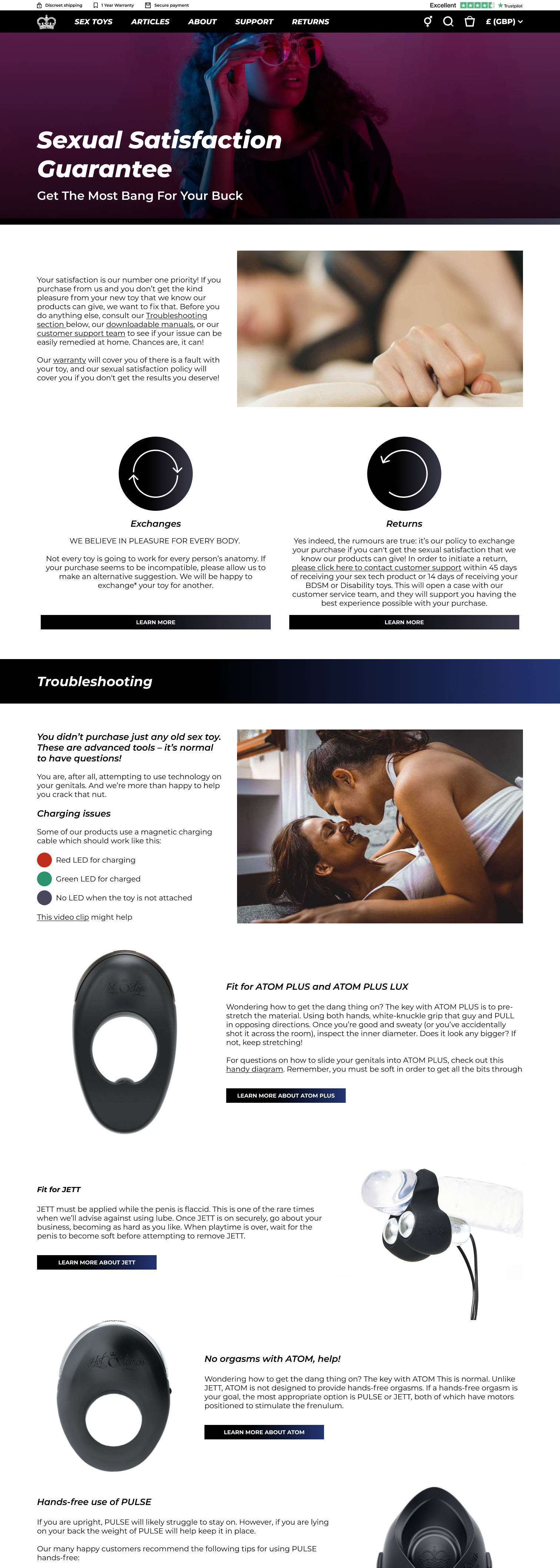
The new content pages. The new components allow the content team more flexibility in laying the pages out
Implementation
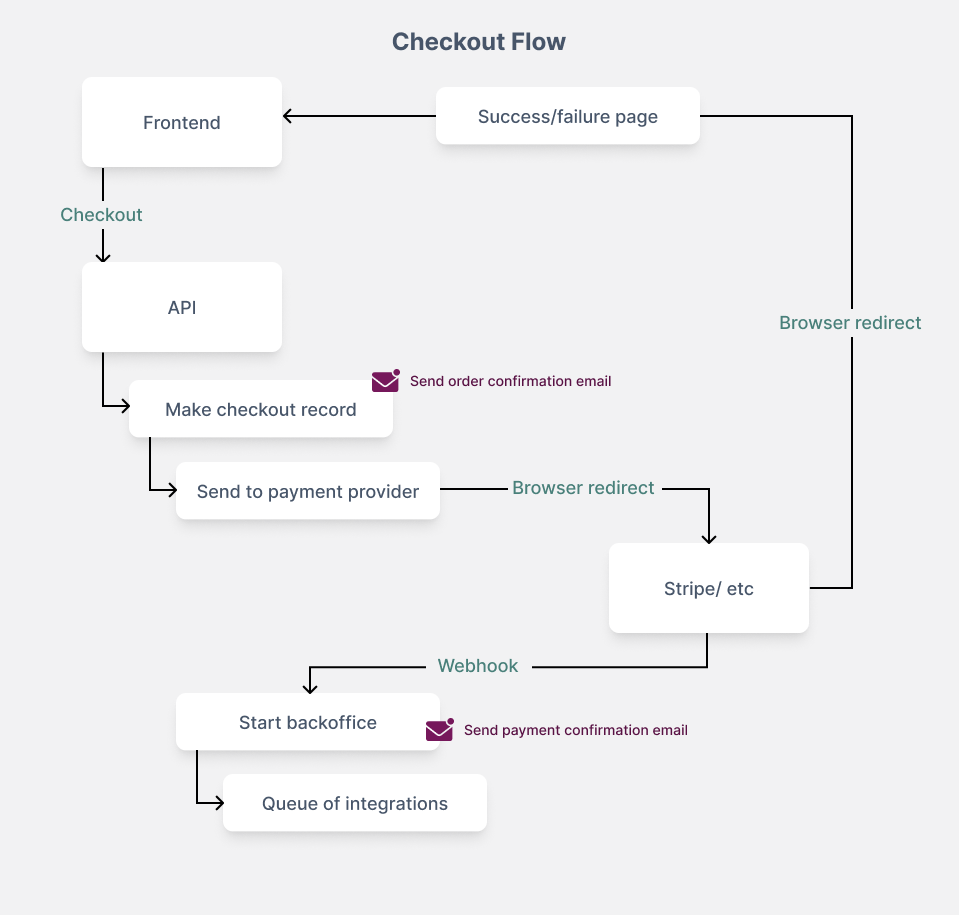
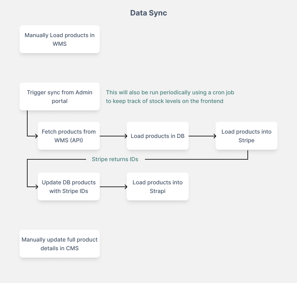
We faced some challenges when it came to implementation. The previous site integrated with many third party systems to handle payment, logistics and marketing. We used a similar architecture because the client didn’t want to change too much about their operations behind the scenes. This caused delays which meant I had to join the development team to get the site delivered. It was challenging but I did enjoy being so deeply involved in each step of the process.
Working on the implementation of the site allowed me to understand the logistics of the business very intimately. This helped me support the site once it was live as I could easily discuss the technical details of certain functionality with the operations team.
Reflection
After launch we saw the conversion rate and the revenue both increase by 40% (March 2023 compared to March 2024). The content team has reported a huge improvement in their experience loading content on the platform.I have been the account manager for the site since launch as BIGBrave continues to support the site and develop new features for Hot Octopuss. Some interesting new developments have been creating a spin the wheel feature for promotions as well as overhauling the entire checkout process (that’s a story for another day)
Looking back on this project it was challenging but extremely rewarding. I really enjoyed working with a client who’s vision and mission aligns so closely with my own beliefs. There are some key areas I would have liked to explore in more detail given more time:
- I would have liked to get a deeper understanding of how specific changes we make to the website affected conversion rates.
- I would have liked to run some A/B testing on our designs. A lot of the design decisions were made based on the client’s instincts, given our recommendations.
- The content team collected a lot of analytics on the site but I would have liked to analyse them more and integrate them into our design process more.
The live site can be viewed at www.hotoctopuss.com
