Wild Bird Revolution was a platform for birders, funded by National Geographic as an awareness and fundraising tool for the Wild Bird Trust.
The Wild Bird Trust has a community of over 1.1 million people on their Facebook page which focuses on bird photography. They wanted to have greater control over the content that was posted and had a dream of creating an atlas of bird sightings around the world which could be used for scientific and conservation purposes.
We created the full platform from start to finish. Francois and Brett started with a design sprint to gather the platform requirements and to create an early prototype of the platform. The project was then handed over to me. I went into detailed planning of the functionality. I then completed the design before leading the build of the platform along with Gabriel, Falakhe and Noah.
Project Initiation and Collaboration
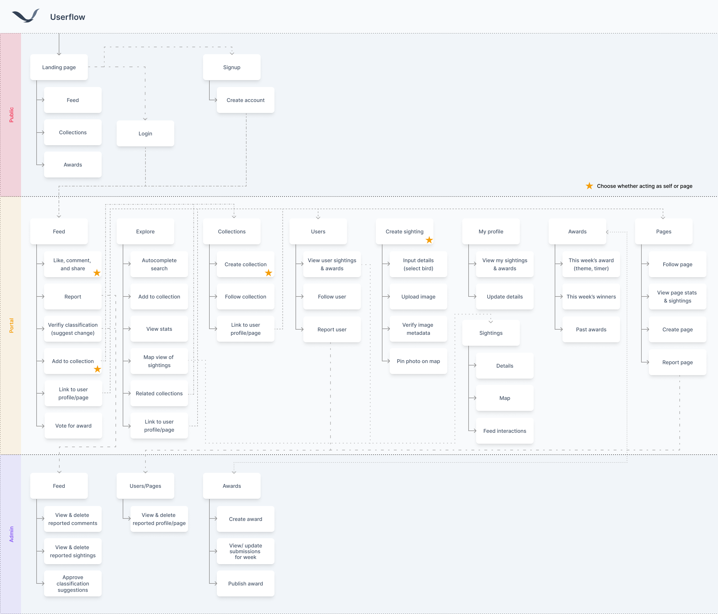
I joined the project after a Brett and Francois’s design sprint had been completed. I was given the notes from the workshops as well as some early stage designs. From this I compiled a user flow which detailed the different features across the three platforms we chose to build, a public facing landing page, the main portal and an admin portal.
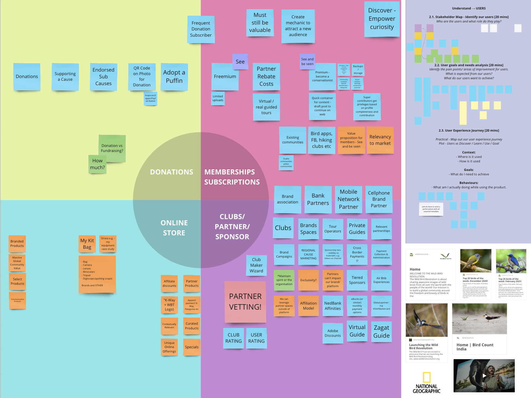
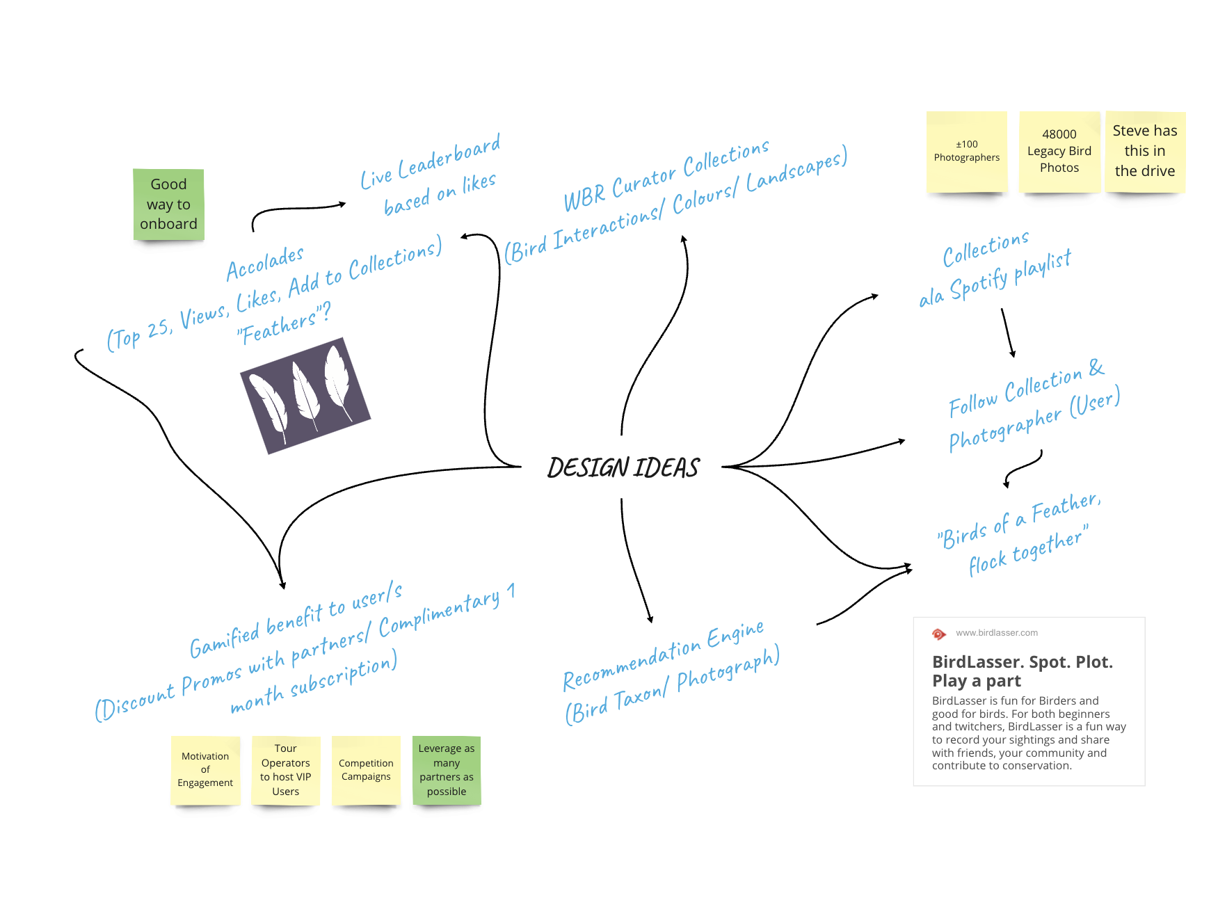
Screenshots from the workshop Brett and Francois held with the client on Miro
Design Evolution and Enhancement
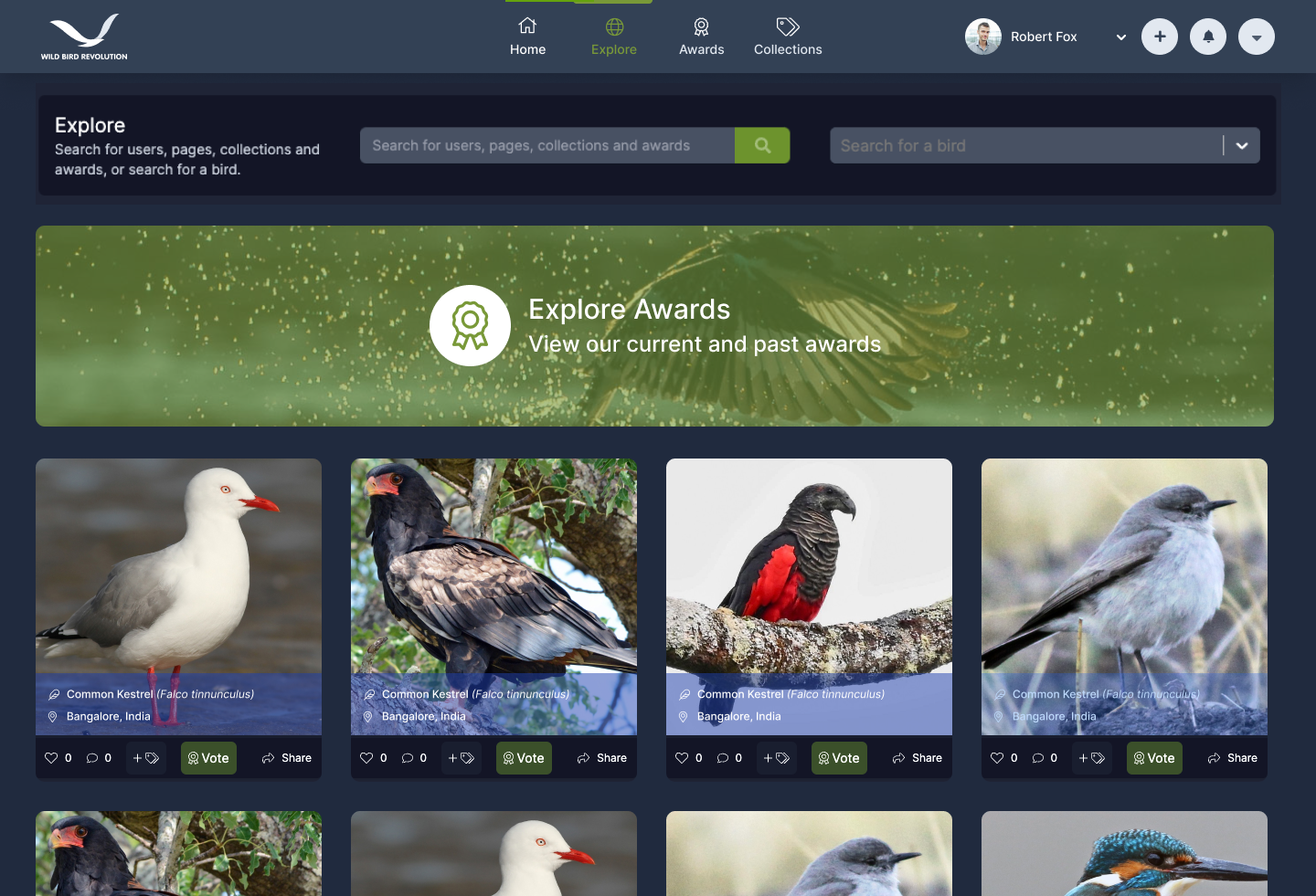
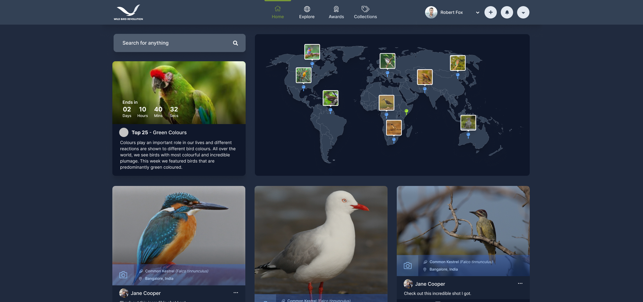
I then moved on to revising the early stage designs. A clear change between the initial designs and my revised UI is the colour scheme change. We chose to go all dark to differentiate the Wild Bird Revolution platform from the Wild Bird Trust main website, the client wanted them to look similar but with their own personality.
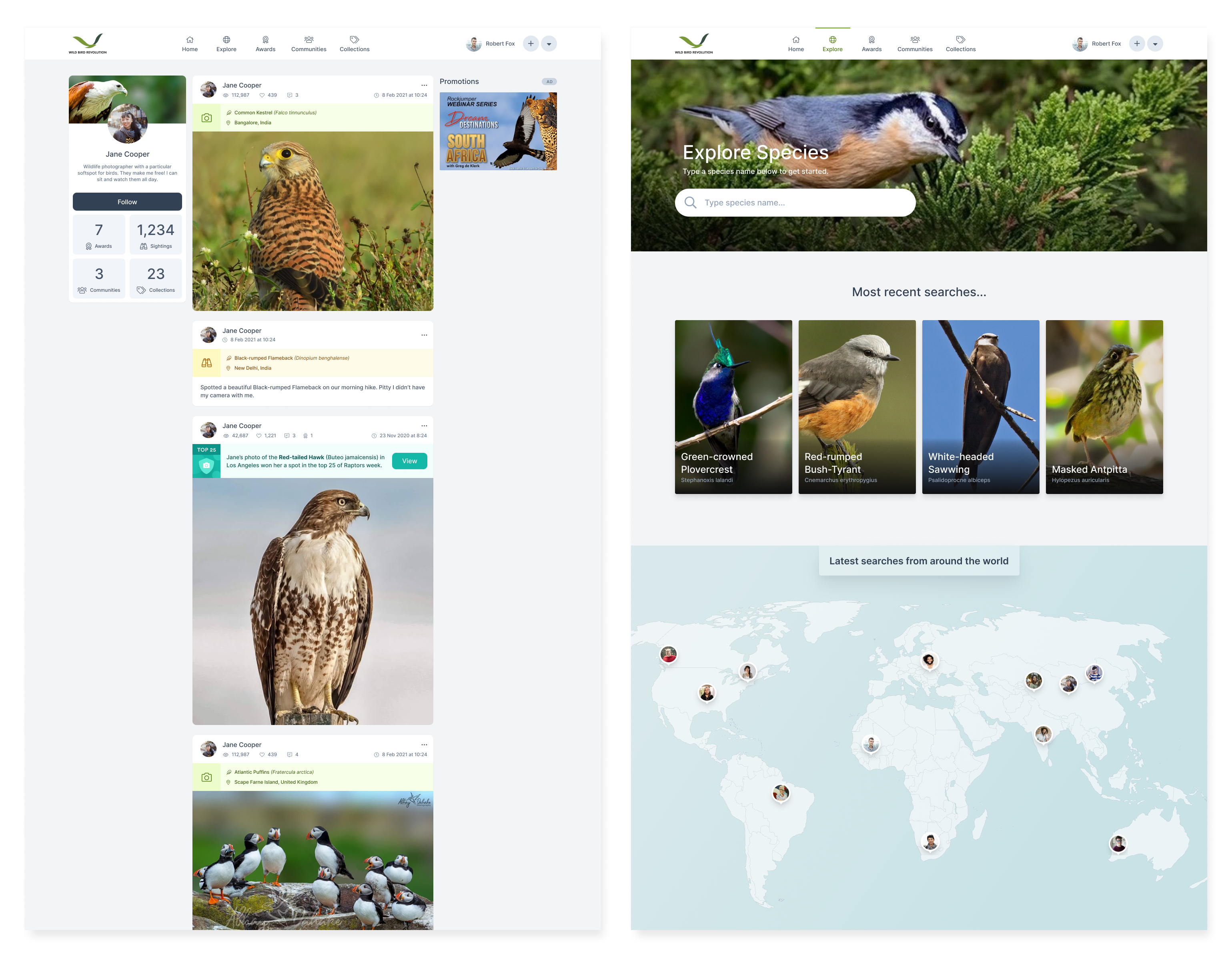

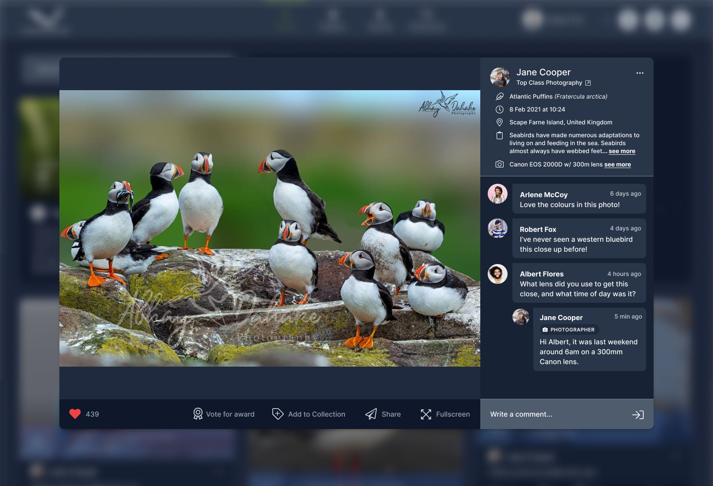
A key structural change I made was to include a feed and a more detailed explore page. The initial designs included a user profile and a search page. From here the only way to find another user’s sightings was to search for specific birds or look on the map. Following patterns seen on other image sharing platforms like Pinterest and Instagram I chose a grid structure for the feed and explore page. This allows users to see many images from different users at one time, they can then click on the images to get a detailed view of the sighting and all the information about it. This was vital for community building on the platform.
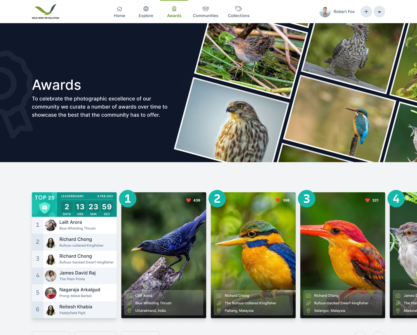
Another change I made to the feed was to highlight the awards and the interactive map. The Facebook audience was already familiar with the awards. The Wild Bird Trust would post about their top ten photos of the week on Facebook. Automating and enhancing this aspect of the community was hugely important to the client. In the initial designs the awards were only accessible on a dedicated page. We believed the gamification of the platform would bring more return visitors, excited to see which award they could win each week. Because of this I chose to place the award of the week spotlight at the top of the feed. I included a countdown on the awards to create a sense of urgency to submit your images and vote for other images.
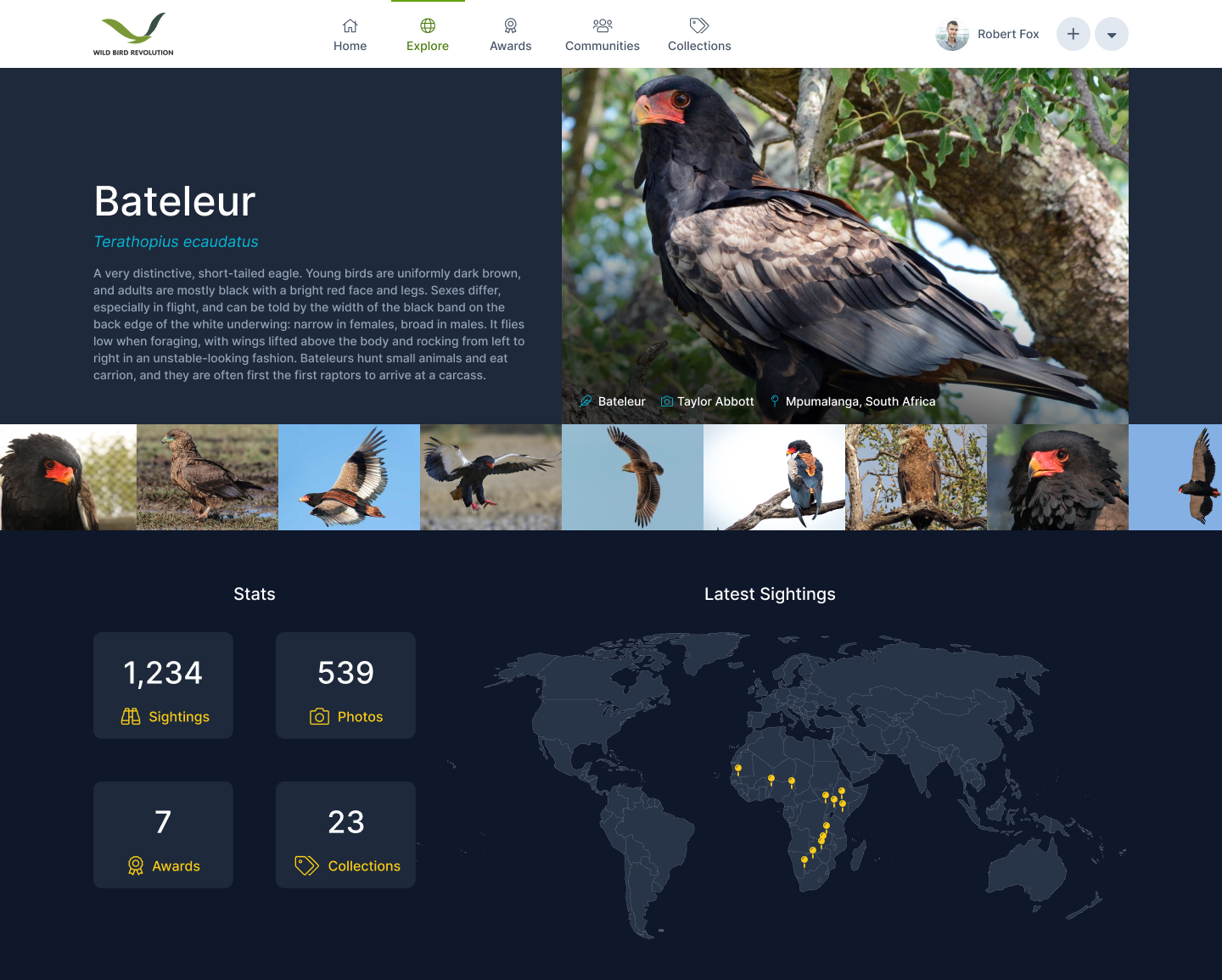

In the initial designs the interactive map was only present on the bird detail page, without images. I chose to highlight it at the top of the feed as well. The map was important to achieve the goal of showcasing their atlas of sightings from around the world. Another interesting goal for the map was to track bird migration patterns or rare bird sightings. The map showed a handful of the latest sightings on the platform, regardless of if you follow the person or not. Users can therefore more easily find new people to follow on the platform.


Implementation and User Testing
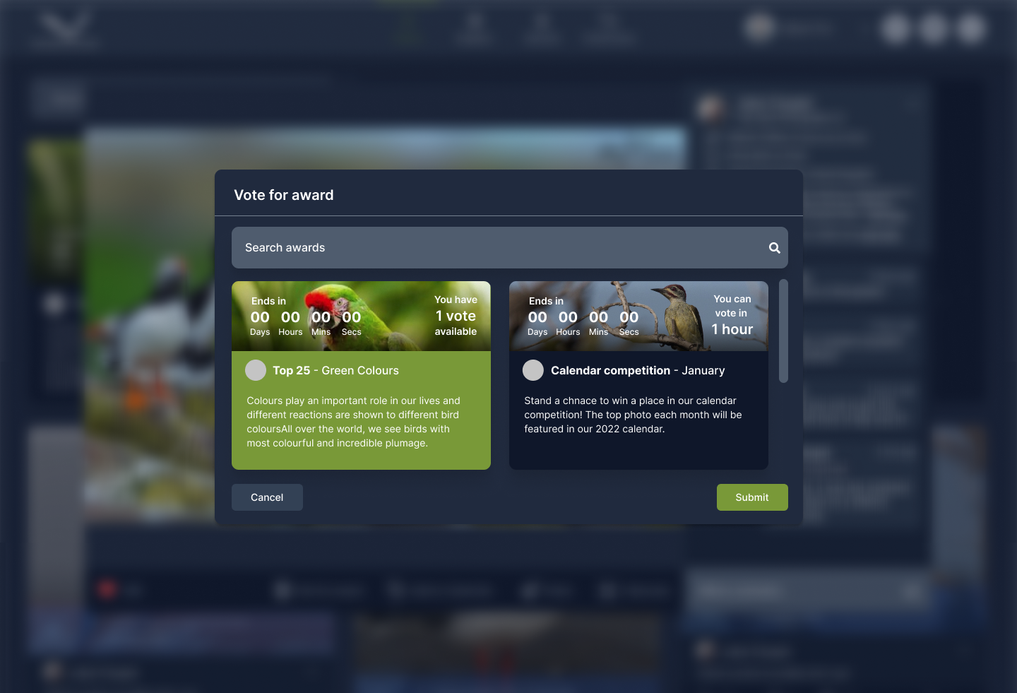
I was the lead frontend developer and managed the backend development team to ensure features were implemented according to the designs. Once implementation was complete we ran a beta testing phase with a handful of trusted birders. This testing pointed out that a few users found the awards system to be confusing. Particularly they did not understand that any image they posted on the platform was eligible to win an award as long as it got votes from other users.
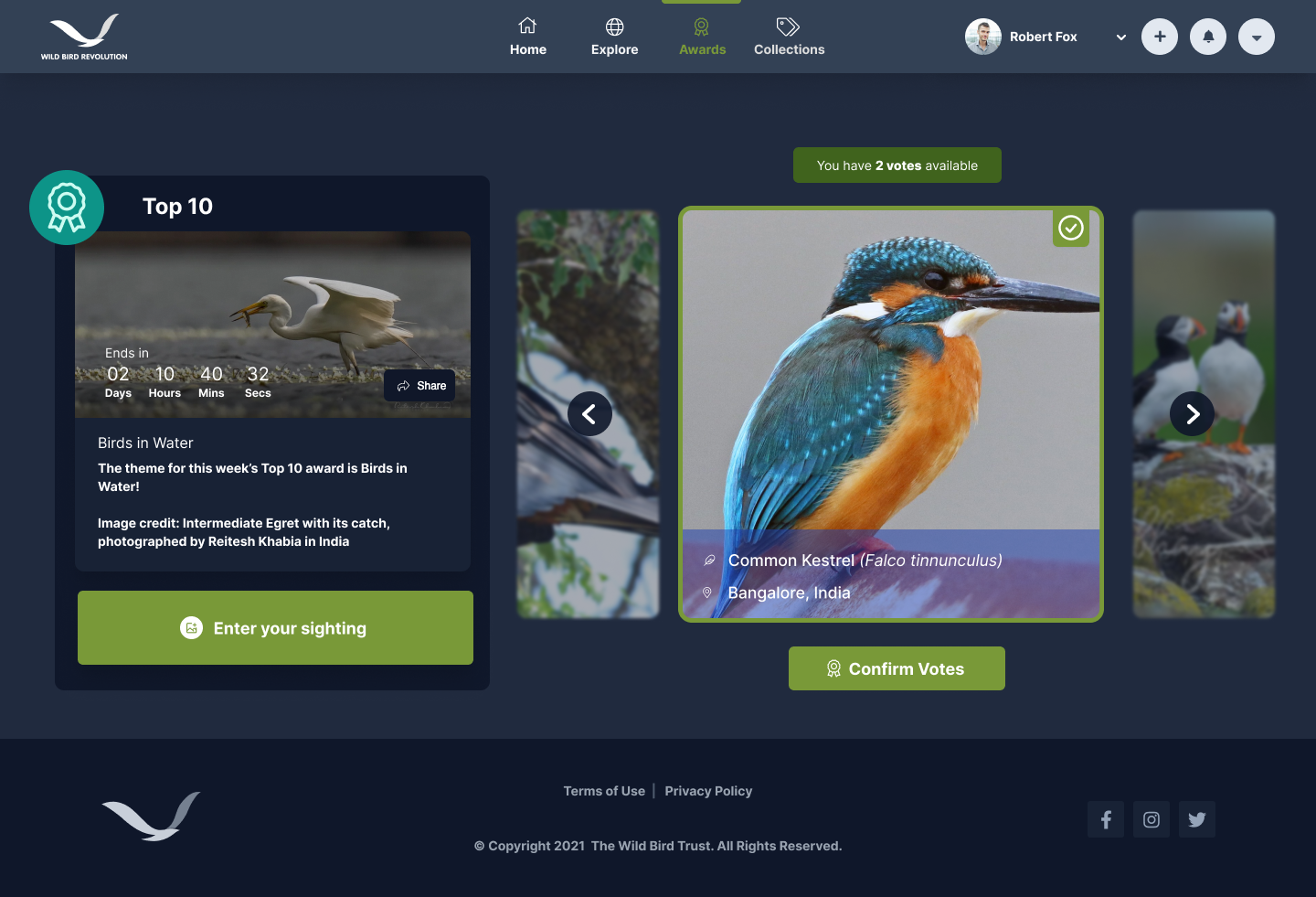
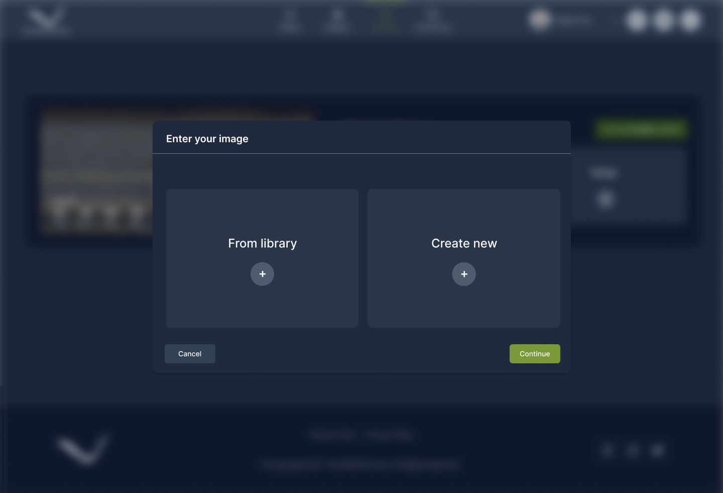
I worked together with Carmen to redesign the feature. The key change was instead of voting for images within the feed users would submit their images to a specific award and other users could vote on the submitted images. After the full launch of the platform we saw that this change was very successful; the support team received far fewer queries about how the awards system worked, whereas that was the main sticking point during the testing phase.
Project Lifecycle and Reflection
The platform was running for just under 2 years before The Wild Bird Trust chose to shut it down. The support team costs were too high and the monetization strategy didn’t take off as they had anticipated. During its run it saw 40,000 unique visitors with 10,000 sightings posted on the platform. There were many daily users who posted sightings multiple times a week.
Looking back on the project, there a few things I would do differently given the opportunity:
-
I would have conducted more structured user testing by prototyping the designs before we built the whole platform. This would have allowed us to be more flexible in the changes we made, specifically to the awards system.
-
I would have advocated more strongly for the development of the monetization strategy to allow the platform to be more sustainable.
